1. Current users want simplicity, familiarity, and personality
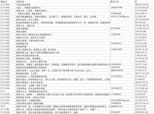
To better understand existing user painpoints, I aggregated all user feedbacks in the recent three weeks into an excel worksheet and categorize them base on key terms, to locate the liked, wished, and longed for and did in-depth interviews to better understand the context. Through the feedback analysis, we found out that the majority of users required simplicity and customizability for the app.
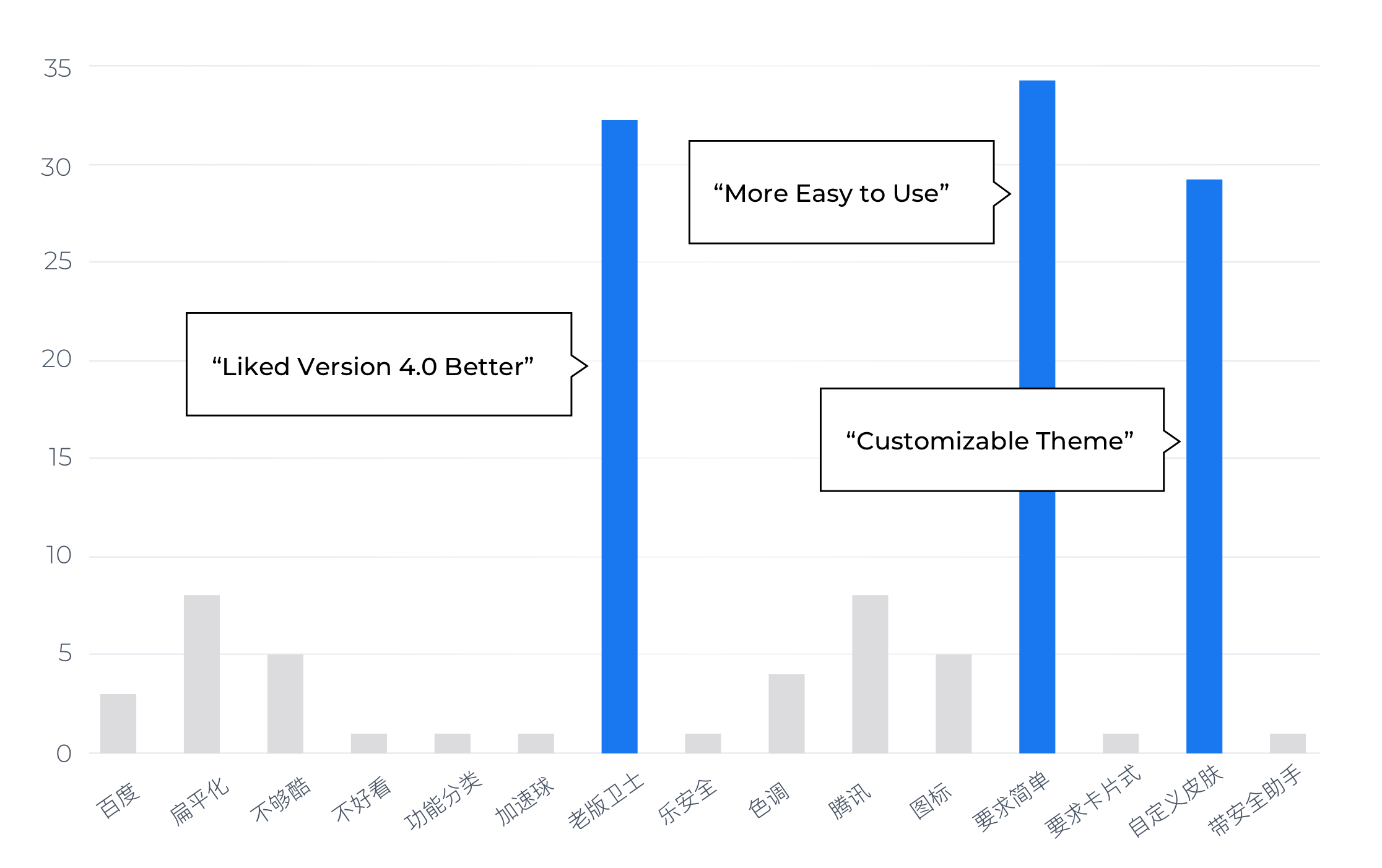
Request to revert back to the 4.0 version interface that adopt Windows Phone's tile like structure and provides actionable statements on the homepage was the 2nd most frequent request.
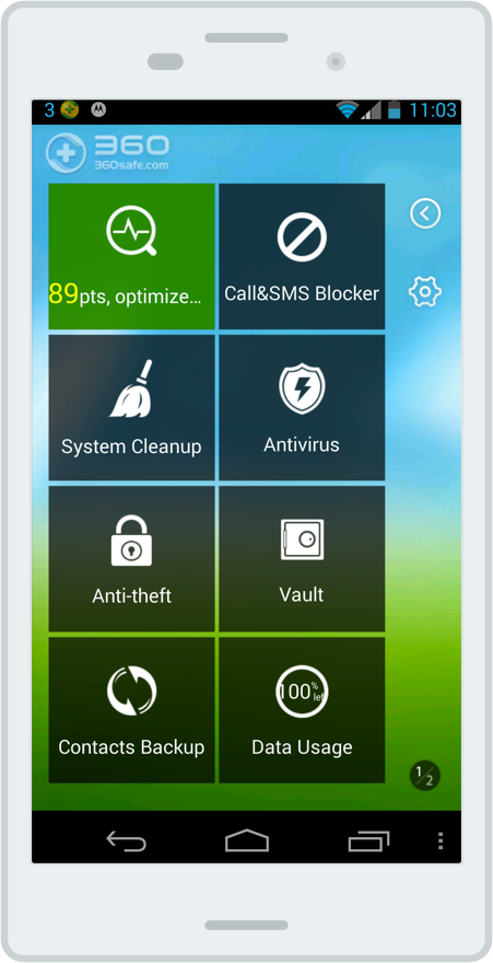
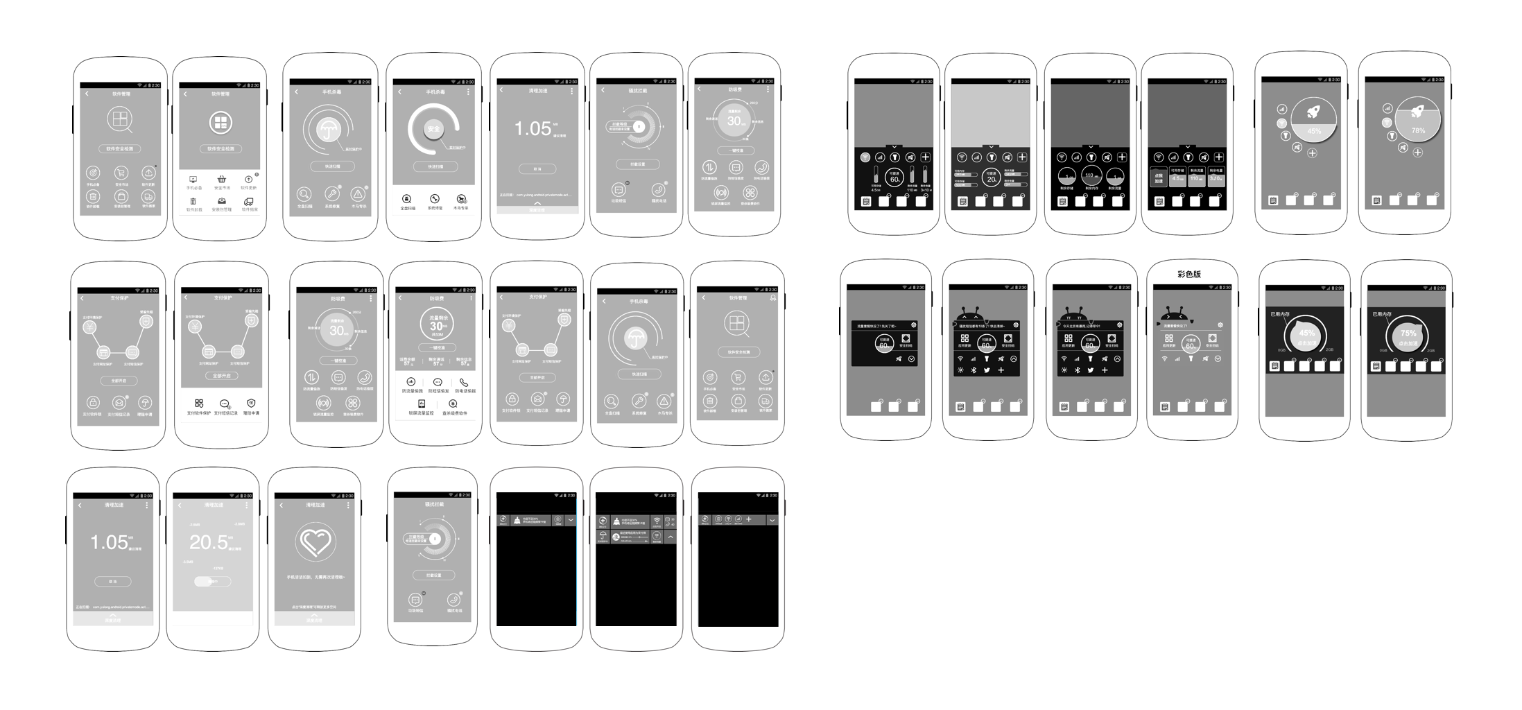
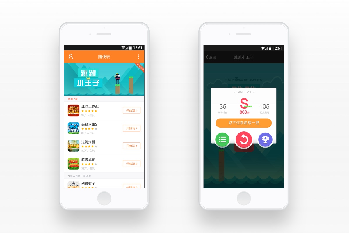
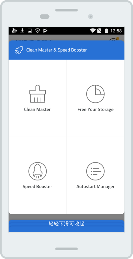
Version 4.0 (Older)
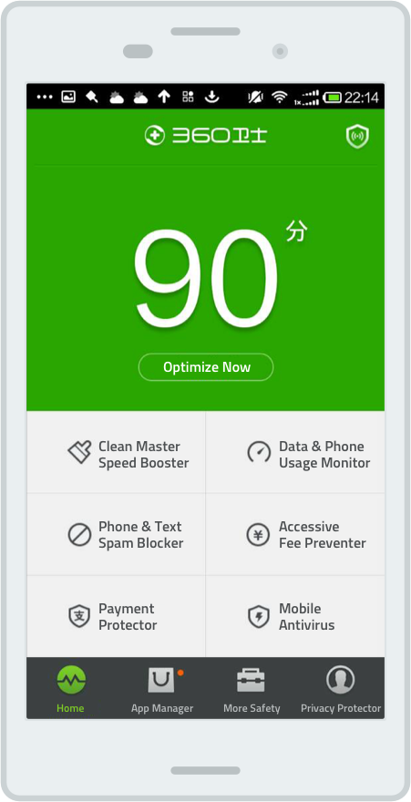
Version 5.0 (Current)
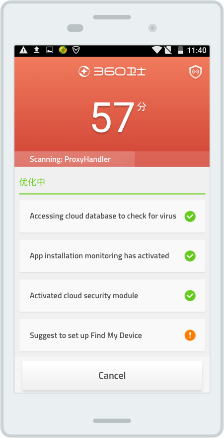
Version 5.0 - Scanning
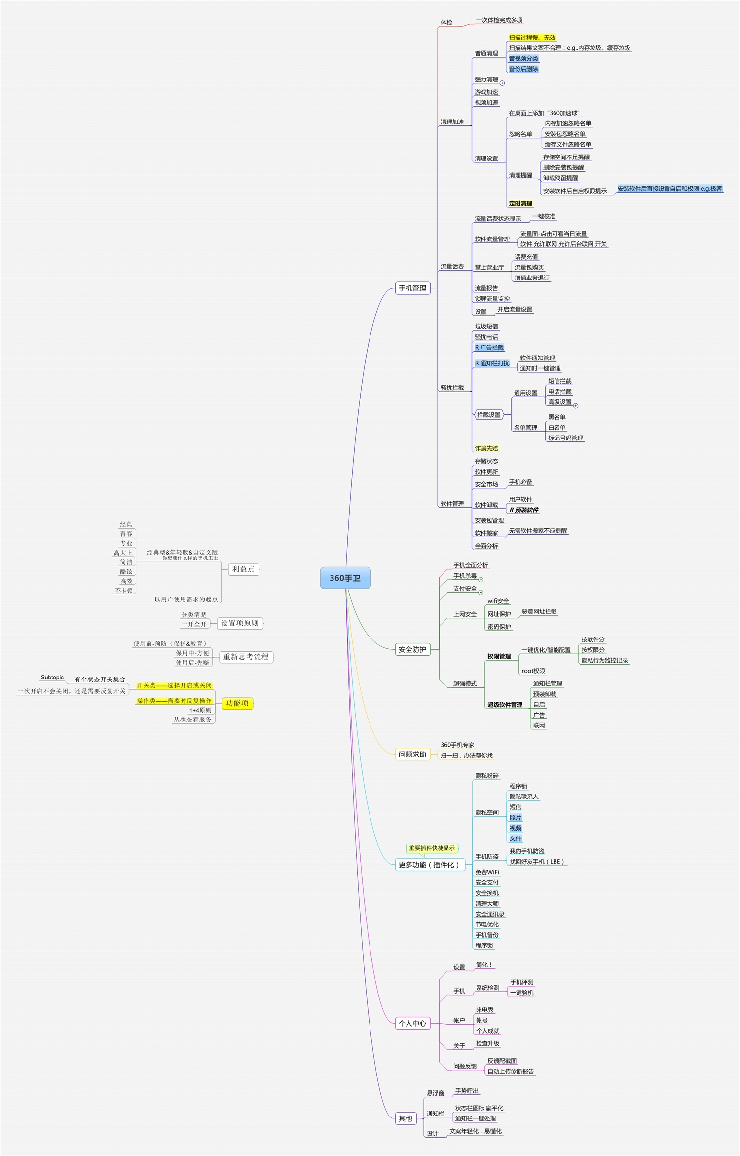
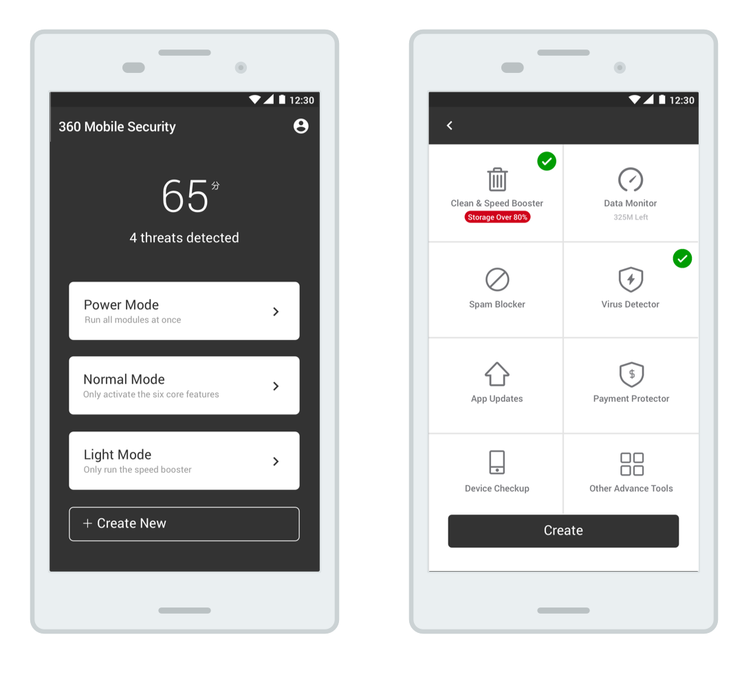
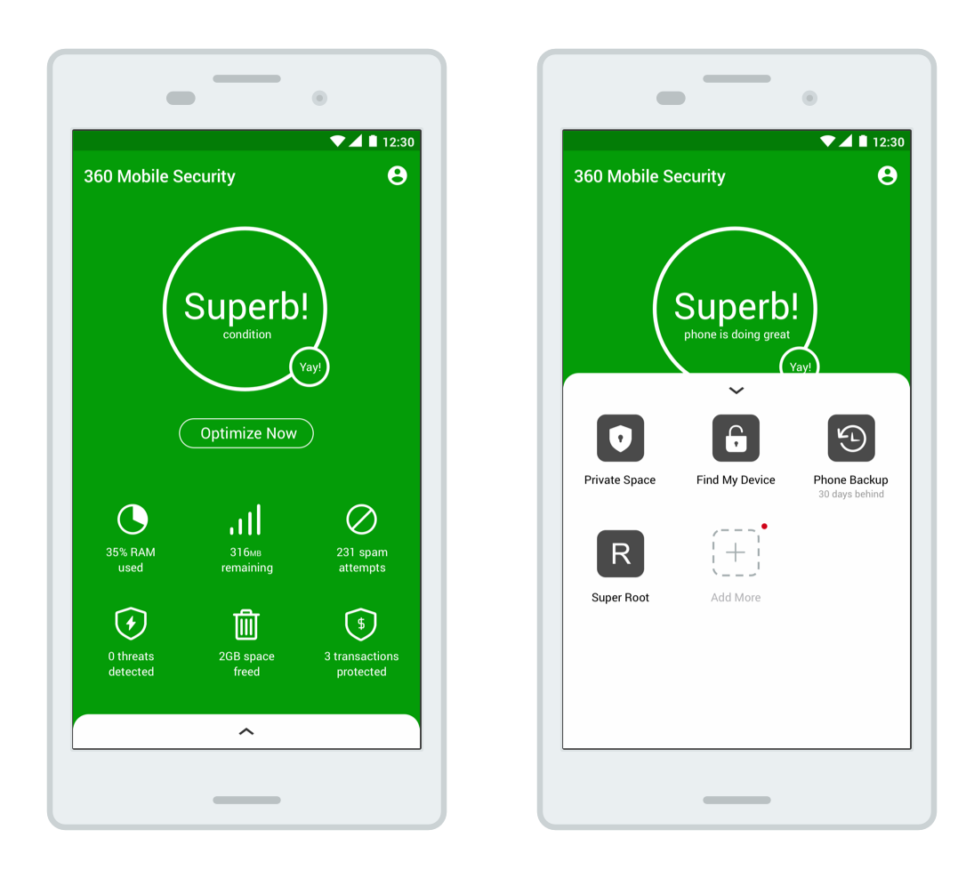
2. 360 Security is packed with features that are too technical.
To better identify current problem and competition, we conducted competitive analysis on key competitors based on their features, information architecture, design, and unique selling point. We also investigated on their product forums, fan groups, and other relevant social media for feedbacks from users to better identify their users' point of view.
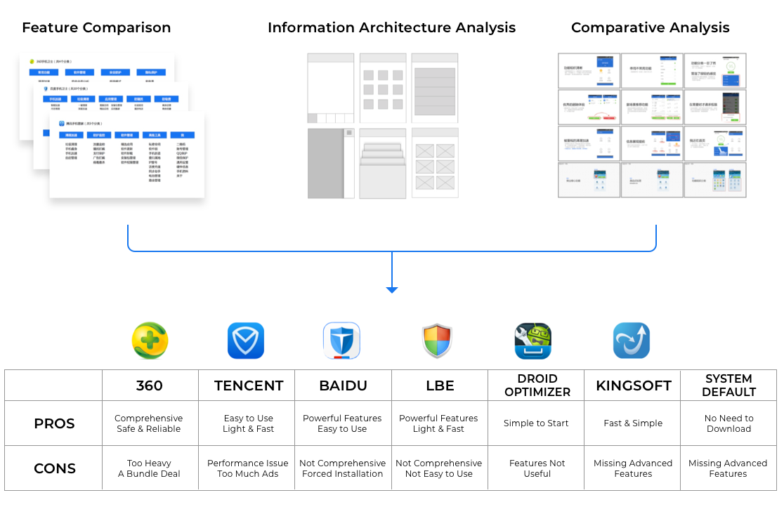
We found out that as compared to its competitors, especially its rising competitor Tecent Mobile Security, 360 Security is offering too many functions that are packaged under names that doesn't accurately present its value to users.
"If there's already a speed booster, why do I still need a power speed booster? I felt that its slowing down my phone rather than helping it"
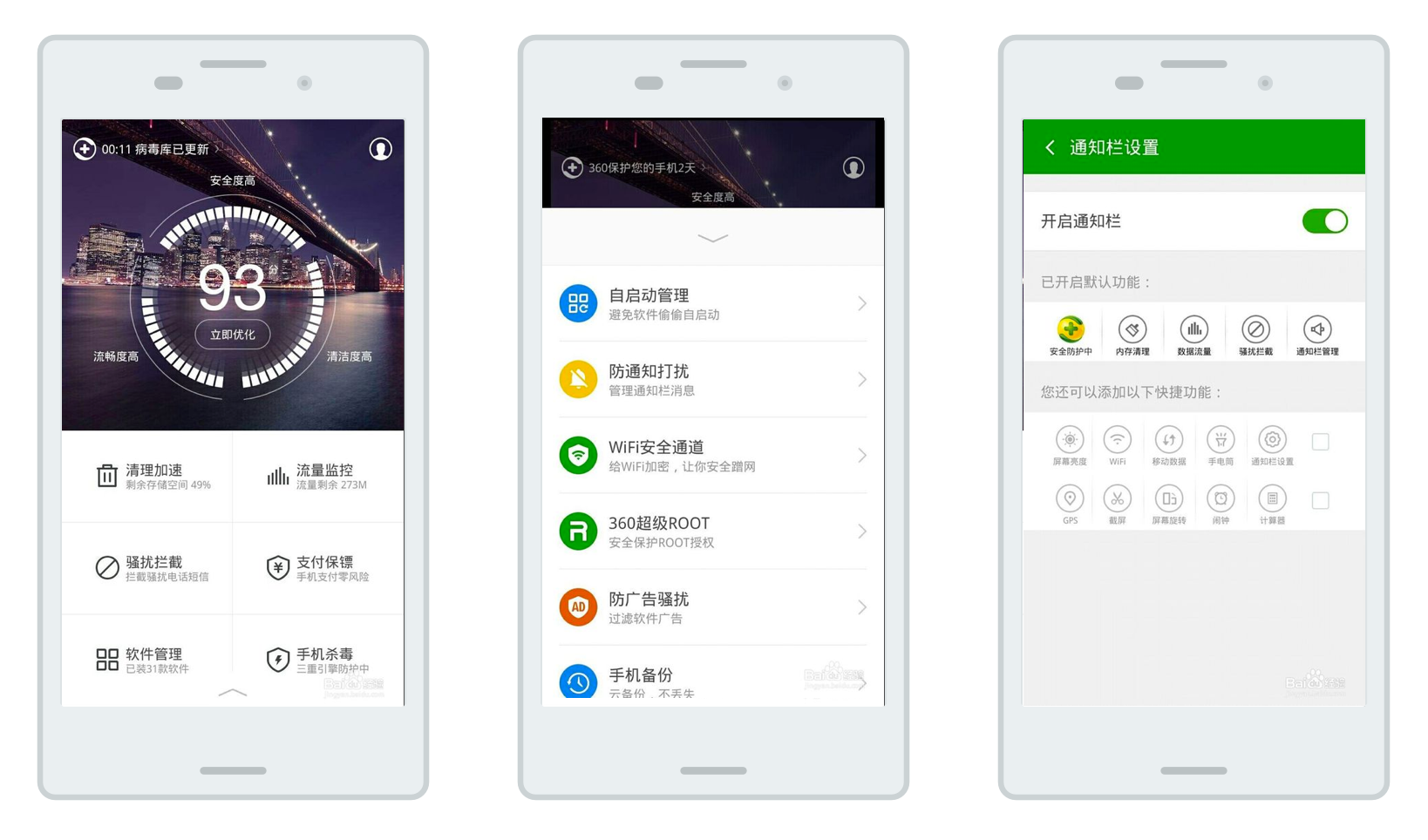
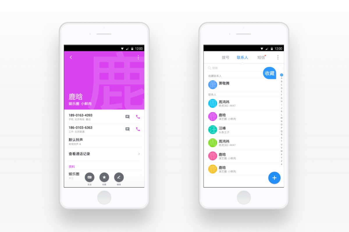
360's Homepage
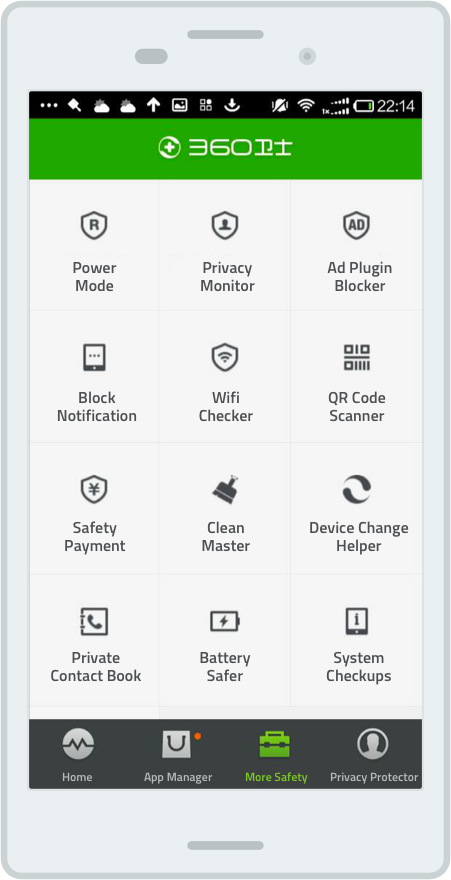
360's Subfeatures
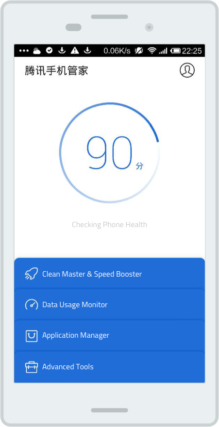
Tencent's Homepage
Tencent's Homepage 2
3. 360 Security are not very popular among teens and female.
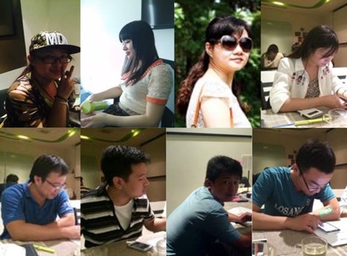
For the user research report, 200+ Surveys, 8 interviews, and 3 focus groups were done to formulate what users care for and whether this app delivers. A lot of it confirms our findings gathered through user feedback platform
One interesting thing that we picked out from the report is that the majority of 360 Security App's current users are young male adults from 19-34.
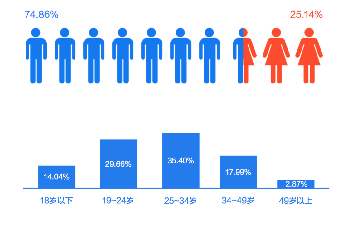
Women and teenagers are not interested in trying this app because they think it is too complex and function oriented. They want something that is functional but also aesthetically pleasing and easy to use, while the current version is perceived as generic and complicated.