2nd Brain
A Medication Reminder System for teenagers with chronic illness

Role: Product Designer | UX Researcher | Design Lead

Team Size: 6      Date: 2017/1-2017/4

Category: Product Design User TestingContext-aware Design

Intro

Design clinic is the University of Michigan School of Information's student led design consulting agency that provides UX support for on-campus and local startups as well as faculty research projects. Last semester, our client was Dr. Joyce Lee, cofounder of the Lenovo Health Design By US Innovation Co+Lab, which has a mission of exploring the future of digital innovation in the health realm.

Team & My Role

I worked with five other designers on this project mainly leading the design process. I was responsible for synthesising research insights to personas and storyboards, designing the user flow for the entire application, and creating the wireframes for the main page and the ally features.

Inspiration

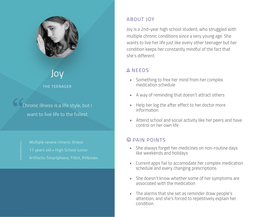
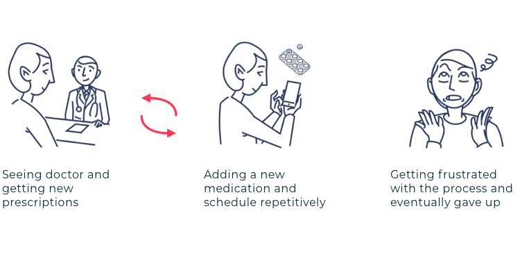
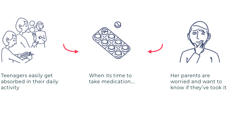
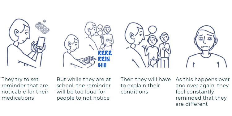
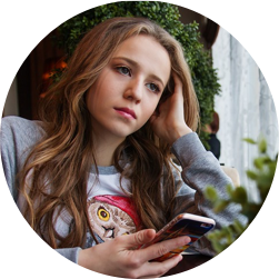
2nd brain was a project initiated by Joy (alias), a long time patient of the founder of our client, who suffers from multiple chronic conditions since a very young age. She wishes for a solution that can help her better manage her complex medication schedule and monitor her ever changing health conditions.

"Chronic illness is not something that will magically disappear, I quickly realized that taking medications and going to doctors will become part of my lifestyle."

Joy, 16 year old high school student with chronic illness

In fact, she was not a single case, a study by NIH in 1991 estimated that 31.5% of US adolescents have at least one or more chronic conditions, this includes allergies, asthma, and depressions.

Goal

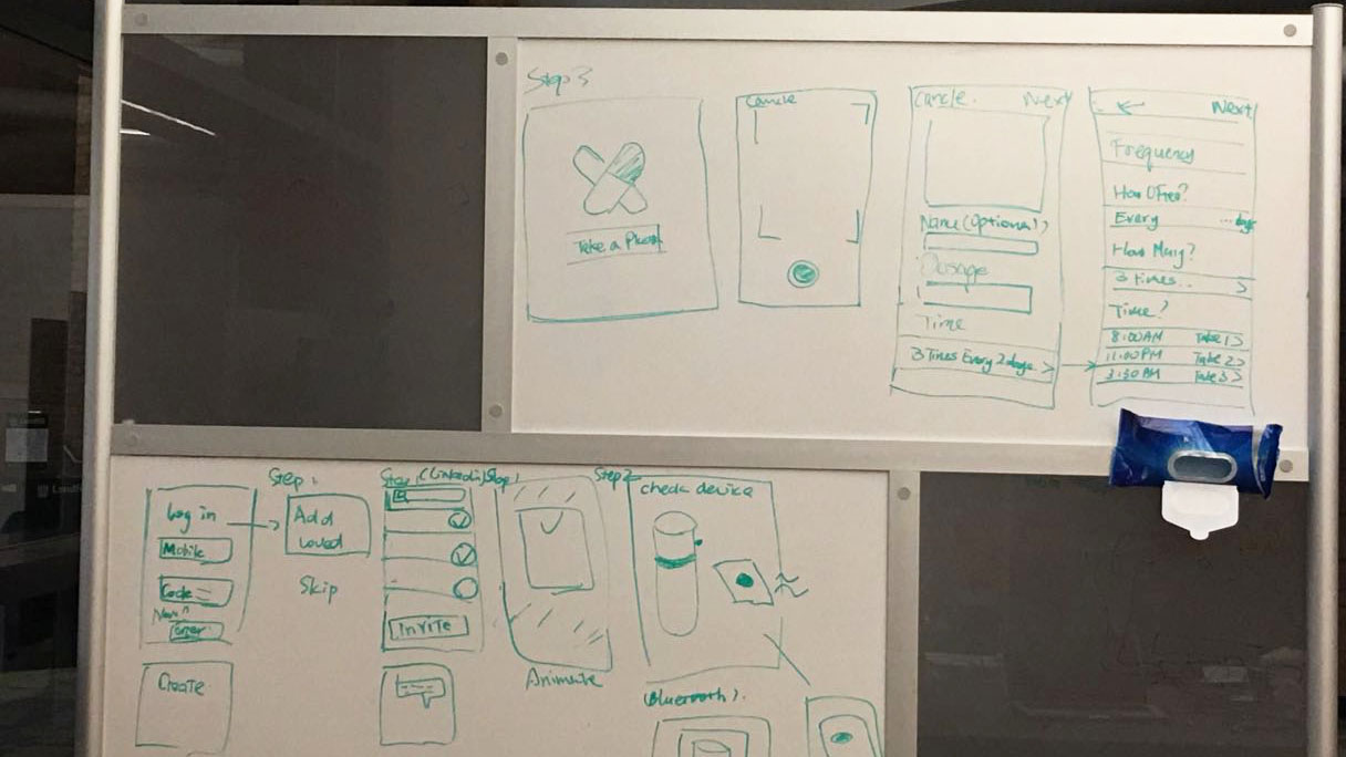
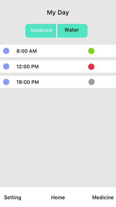
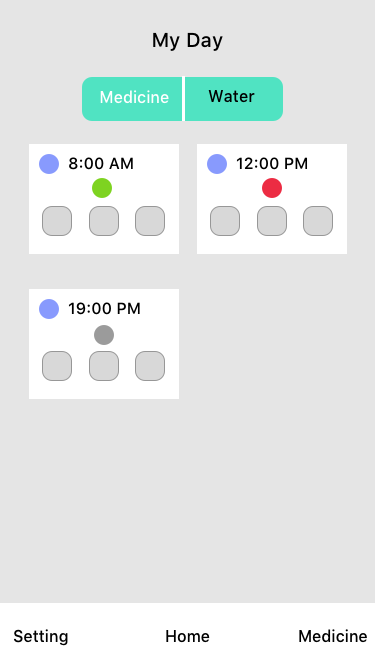
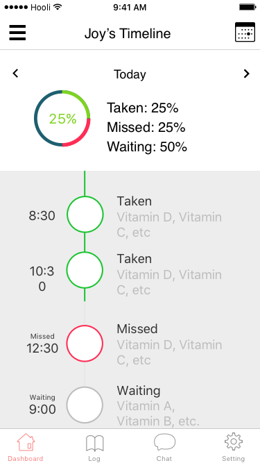
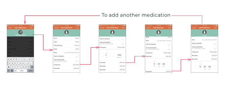
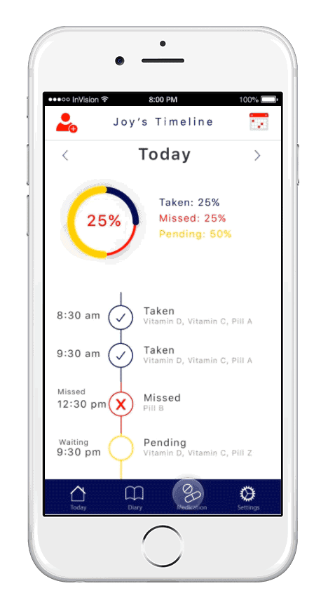
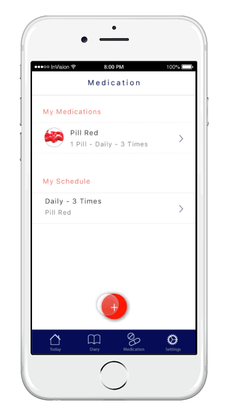
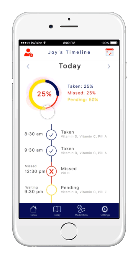
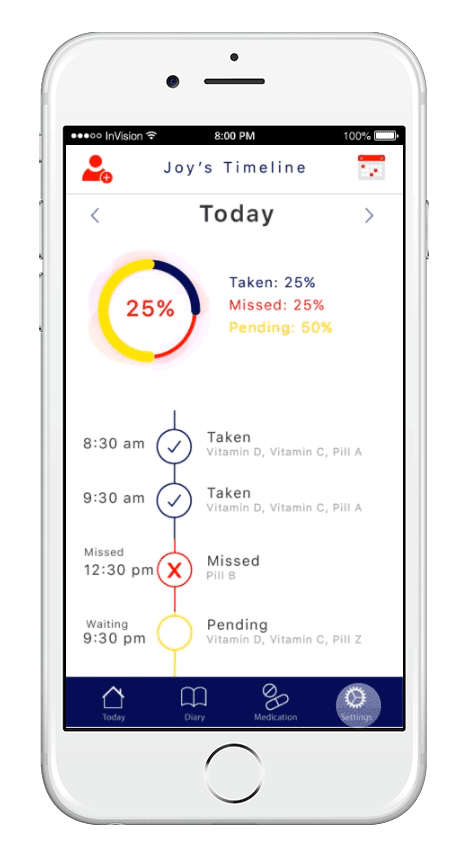
Design an app that help people like Joy to manage their complex medication needs and improve medication adherence in an unobtrusive way.

Research

Before this project, none of the members on the team have experience working on health related projects and know in specific what are the struggles that these adolescents with chronic conditions are facing, so we put in lots of efforts to do research that helps us better understand this population and the complexity of the problem.

Our Users

To better understand the daily life and challenges of adolescents with chronic illness, we conducted 2 in-depth interviews, 2 focus group at the Mott's children hospital, 1 caregiver focus group and 6 interviews including pediatric practioners and pharmicists.

Here are some key findings that we were able to extract from our research:

  • Teenagers are more likely to forget to take their medicine on non-routine days such as school outings or vacations.

  • Their parents are usually actively involved in their medication adherence routine and are their last resort when they forget.

  • They don't want people around them, especially their classmates to be overly aware of their chronic conditions.

  • They are very conscious about missing a dose and some would like to consult their doctors immediately, because sometimes missing one dose is crucial for their condition.

  • When in school, school nurse plays a huge part in ensuring their adherence, because most schools require them to store their pills at the school clinic.

From that, we extracted some of their key characteristics and created the personas.

Competitive Landscape

We did comparative analysis on over 20 products that support patients with chronic illness in the market and revisited those competitors after the user research.

Competitive analysis overview

Affinity wall to synthesize results and develop new design ideas

By doing competitive analysis, we identified four important areas that haven't been explored by existing applications in the market, and decided to focus our design in improving those aspects.

Target Audience Device
There are only a few apps that targetted teenagers.
Although they have UI with vibrant colors to attend their audience, they haven't much do differentiation feature wise.
Most of the apps cannot be integrated with wearable devices and are based mostly on phone.
From our interviews, a lot of teenagers aren't allowed to bring their phone in class and even when they can, the alert is either too intrusive that brings unnecessary attention or isn't differentiable from the gazillion other notifications.
Scheduling Process Med friends
Most of the current apps only allow users to add one medicine that has a fixed schedule.
However, most of the time users take several medicines at the same time, and depending on their conditions, a doctor visit might completely alter their prescriptions.
Some apps allow users to invite caregivers.
However, our users find it rarely helpful because most of it won't allow their caregivers to remind them when to take medication, or if it does, it notifies their caregiver for every little thing with no contextual awareness or customization.

Ideation

At the beginning of ideation phase, we've brainstormed lots of different ideas that took on a more pervasive approach and analyzed the pros and cons based on our user interviews and client feedbacks.

Digital Sticky Notes Adhesive Patch Smart Water Bottle
Pros The sticky notes can be attached to different artifacts in life and reminds the users. The patch can send alert without attracting the notice of others. Many users also need to drink a lot of water and track their water intake. They can be reminded every time when they drink water. Some teenagers think this water bottle is very cool.
Cons The reminder is too obvious and has many pieces to manage. It is not very practical. The technology has not been adopted widely. Boys might not want to carry a water bottle. The reminder might be obvious.

However, after touching base with our client, who is eager to push it towards development, we decided to focus on solutions that are more feasible and reframed our design goal to a mobile application that is user-friendly and context-aware for our target audience which is teenagers.

Wireframes

To work collaboratively, we conducted an 8 hour design sprint to synethesize our research findings and do whiteboarding for the final design of the homepage and key features.

Whiteboarding on user flow and key features

Afterwards, we also wireframed different versions for the homepage of the app.

List

Pillbox

Timeline

Design Solution

With all the previous work done, we decided to focus on designing an application that focus on a couple of key issues our users told us to create a comprehensive improved experience for our target audience

Interaction map of the entire system


Issue 1: Unintuitive scheduling process

Through interviews and competitive analysis, we found out one common issue that our users are struggling with while using existing apps is the annoying adding medication workflow.

Competitor's steps of setting medication reminder


Solution 1: Add medication to existing schedule


  • Allowing users to add multiple schedules to one medicine.

  • Taking a picture of the medicine and giving the medicine a nickname reduces their cognitive burden.

  • "Add to existing schedule" feature allows users to easily add a new medicine to already scheduled events.

  • Adding a medicine directly from a calendar makes scheduling more intuitive.


Issue 2: Not effectively involving caregivers

Another common issue that we found out is that our users heavily rely on their caregivers for their medical adherence while caregivers also feel responsible and constantly worry about their well being.

“The last time I forgot was during a college school trip, and my mom called me and required me to take a photo of me taking the meds”


Solution 2: Choose when to notify your ally


  • Users can invite their caregivers, school nurse, close friends, or whoever that's relevant to them to remind them about their medication schedule.

  • They can pick when to notify each ally and what to keep them updated.

  • They can also select through what ways to notify them so that for those who care the most, the notification will be more intrusive.


Issue 3: Obtrusive reminder making peers over aware of their conditions

Another key issue with existing ways of notification is that the reminder set would either be unnoticable or too apparent, while teenagers don't want people around them to be overly aware of their illness.

Although wearable device is a feasible solution, most apps existing have no integration with them.


Solution 3: Wearable connectivity and customization


  • Users can connect this app with a wearable device or other smart artifacts.

  • Customizable vibration pattern helps them be reminded to take a medicine without catching others' attention.

Impact

Our final design was very well received by our client and Joy, the usability test with chronic illness teenagers also got them excited about having something like this.

It is by far the best thing I've seen for a medication app.​ I love everything, and how it all seems to be so easily adjusted and made to fit your own needs. I love the clean layout, the calendar, the "allies" section, and especially love that you chose the word "allies".

Presentation

Other Projects


  • All
  • Experience Design
  • User Research
  • Product Design
  • Website
  • Mobile App
360 Mobile Security Redesigning a mobile security app used by millions
Join.com A group purchase website for college students
Umma Museum visitor experience consulting
EasiGame App Designing a HTML5 game platform from scratch
OS Contact App Designing the communication system app for a customized Android ROM
Movielens Design and implementation of the tagging system for a movie recommendation system